Tag: design
Kaisa Koivisto & Uta Laurén: Suomalaisen taidelasin kultakausi [The golden era of the Finnish glass]
19 March 2015 | Mini reviews, Reviews
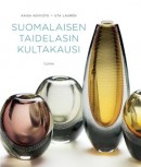 Suomalaisen taidelasin kultakausi
[The golden era of the Finnish glass]
Helsinki: Tammi, 2014. 326 pp., ill.
ISBN 978-951-31-7320-3
€49.90, hardback
The authors of this book specialise in Finnish glass and its history, working at the Finnish Glass Museum. The 1950s and the early 1960s formed the golden age of Finnish glass: young artists such as Timo Sarpaneva, Tapio Wirkkala, Gunnel Nyman, Nanny Still and Kaj Franck all began gaining fame as the number of prizes won at the 1950s Milan triennales made way for their international success. Finnish glass factories worked closely with artists, as serial production had to provide the commercial success. In the 1970s, however, the glass industry began to diminish due to heavy competition in the form of imported glassware. Unique objects of glass are still made and glass artists trained in Finland, but of six major factories only Iittala (est. 1881) is still working; for example, the 220-year old Nuutajärvi Glass Factory closed its doors in 2013. The majority of the excellent photographs in this comprehensive, beautiful book are from the Finnish Glass Museum or the Finnish Design Museum. The book includes short biographies of 27 Finnish glass artists and histories of glassworks as well as a glossary of glass-making terms.
Rooms with views
21 August 2014 | Extracts, Non-fiction
Most of us live in box-shaped houses; the long-prevailing laws of modernist architecture relate to cubes, geometry and masses. Together with an architect, artist Jan-Erik Andersson designed a leaf-shaped house for himself. Could it be both art and architecture? In his new book he takes a look at non-cubical buildings in Finland and beyond, attempting to define what makes ‘wow factor architecture’: good architecture requires freedom from strict aesthetic rules.
Extracts from the chapter entitled ‘Det inre rummet’ (‘The inner room’) in Wow. Åsikter om finländsk arkitektur (‘Wow. Thoughts on Finnish architecture’, Schildts & Söderströms, 2014)
I remember from my childhood in the 1960s how my brother and I each lay in our beds in a little room late in the evening and stared up at the ceiling, onto which the lights from cars outside cast patterns. The patterns were constantly changing, they were like the doors of imagination onto eternity. Along with the hum of the engines they lulled me into a kind of half-stupor.
During the days the floor of the room grew to a town as we threw ourselves into a world of adventures and sped around with Formula 1 cars. Or the waste-paper bin was squeezed into a corner between the bookshelf and the wall, and the room took on the dimensions of a basketball court.
When defining a room it is difficult to distinguish between the outer, physical room, and the inner room formed by your consciousness. More…
Harri Kalha: Muodon vuoksi. Lasin ja keramiikan klassikot [For form’s sake. The classics of glass and ceramics]
24 June 2014 | Mini reviews, Reviews
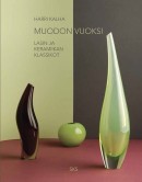 Muodon vuoksi. Lasin ja keramiikan klassikot
[For form’s sake. The classics of glass and ceramics]
Helsinki: The Finnish Literature Society, 2013. 335 pp., ill.
ISBN 978-952-222-402-6
€75, hardback
This handsome, massive work introduces objects of glass and ceramics from the Finnish ‘golden age’ of the 1940s, 1950s and 1960s. Artist-designers Kaj Franck, Tapio Wirkkala, Toini Muona, Timo Sarpaneva and Kyllikki Salmenhaara were awarded three prizes at the Milan Triennale, Rut Bryk and Birger Kaipiainen two, but the number of designers whose works have become classics without these prizes is naturally much larger. The art historian and author Harri Kalha records the exceptional development of industrial design. In postwar Finland, with scarce resources, art and mass production entwined, resulting in high-standard objects of glass and ceramics gaining international fame and becoming part of international modernism. The businessman Kyösti Kakkonen became interested in Finnish design in the 1990s, and now his private collection consists of thousands of objects, from which Kalha has made his choices for the book. More than two hundred photographs, by Niclas Warius, pay tribute to the materials, shapes and colours of the objects as light is reflected from the surfaces, making them appear three-dimensional, both real and dream-like. The printing, by Bookwell, matches the quality of the photography.
The private I? Me and my home
17 June 2014 | Reviews
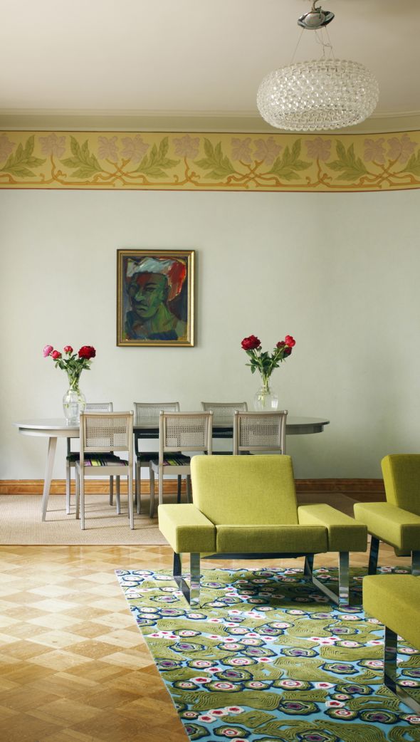
Art Nouveau with a modern twist. Photo: Avaimia ajattomiin suomalaisiin sisustuksiin / Jaanis Kerkis
Avaimia ajattomiin suomalaisiin sisustuksiin
[Keys to timeless Finnish interiors]
Design: Hanni Koroma, text: Sami Sykkö, photographs: Jaanis Kerkis
Helsinki: Gummerus, 2014. 123 pp., ill.
ISBN 978-951-20-9507-0
€32.90, hardback
Katja Lindroos
MOMO. Koti elementissään
[MOMO. The home in its element]
Photography: Riikka Kantinkoski, Niclas Warius
Helsinki: Siltala, 2013. 154 pp., ill.
ISBN 978-952-234-164-8
€32.90, hardback
www.momokoti.fi (in Finnish only)
‘Interior decoration’ has become an extremely popular pastime in Finland – as elsewhere where the standard of living allows it.
Innumerable magazines and blogs keep churning out photos of rooms with large white, cushioned sofas, glossy white kitchen cabinets and white floors on which furniture seems to float forlornly. Walls are decorated with wooden or metallic letters forming words: love; home, sweet home. In the kitchen the bread bin bears the word BREAD. (Bookcases, with actual books, are rare.)
Why is it that in our age which worships ‘individuality’, trends rule? More…
Fiat lux! Helsinki lit
9 January 2014 | This 'n' that
 When there’s no snow in January, as is the case this year, the darkness does make Helsinki appear somewhat joyless. This year Canada and parts of the United States got more than a taste of freezing Arctic temperatures – but at the time of writing winter is still postponed in the lower half of Finland.
A temporary relief was brought by Lux Helsinki – staged now for the sixth time – as light, colour and sound made the capital brighter and more beautiful between 4 and 8 January.
The core of the city, the Cathedral, was adorned by a large heart placed at the top of the steps, beating in colours to music.
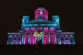
Corazón by Agatha Ruiz de la Prada. Photo: Marina Okras
Corazón, by the Madrid-born artist and fashion designer Agatha Ruiz de la Prada, in collaboration with the production and design company D-Facto, reflects her design themes of love and happiness.
One of the participants in Lux Helsinki was Unen ääret / Edges of Dreams: projected on to the façade of the Hakasalmi Villa (1843–46), between the Finlandia Hall and the Music House, it was inspired by the history of the building and its inhabitants. Now a museum, it became known as the home of a benefactor of the city, a rich and famous woman of her time, Aurora Karamzin from the 1860s to the 1890s.
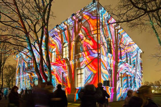
Hakasalmi Villa: Edges of Dreams by Mika Haaranen. Photo: Lauri Rotko
The building was seen through dreamlike visions formed by painted films and shadow patterns by Mika Haaranen, a lighting and set designer and photographer. His works extend from the world of theatre and musicals to contemporary dance, concerts and film. The accompanying music was composed by Aake Otsala.
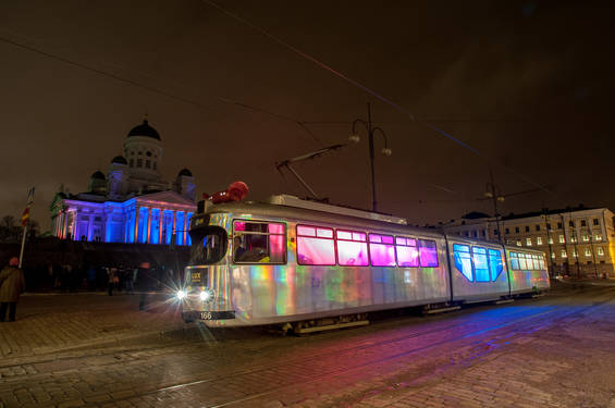
Lux Tram by students of lighting and sound design, Theatre Academy. Photo: Hannu Iso-Oja
Helsinki trams have been transporting citizens from 1891. One of the trams was transformed into a moving light installation by the use of programmable LED floodlights. The work was designed and realised by the Theatre Academy of the University of the Arts Helsinki lighting design students Riikka Karjalainen and Alexander Salvesen. A pity it was not possible to hop on…
A rare bird from Fancyland
20 August 2013 | Reviews
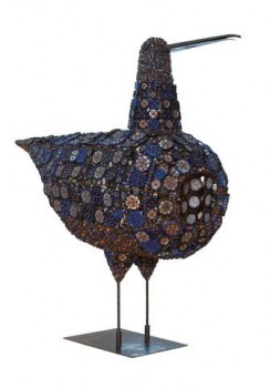
Bead-covered curlew, 1960. Height ca. 115 cm, Collection Kakkonen. Photo: Niclas Warius
Harri Kalha:
Birger Kaipiainen
Helsinki: Suomalaisen Kirjallisuuden Seura (The Finnish Literature Society), 2013. 249 p., ill.
(Summaries in Swedish and English)
ISBN 978-952-222-457-6
€46, hardback
Ceramics confectioner. Degenerate aristocrat. Ornamental criminal. These epithets can be found in Birger Kaipiainen, a new, full-length study of the ceramic artist by art historian Harri Kalha.
Throughout his artistic career Birger Kaipiainen (1915–1988) worked with forms, subjects and methods that were unfamiliar in the field of traditional ceramics, at least in mid-20th-century Finland, and made use of fantasy and ornament. As a ‘porcelain painter’ he showed little interest in the technical challenges of clay – although in his ceramic creations Kaipiainen explored three-dimensional form, montage, colour, texture and the tactile dimensions of the medium. More…
Designbites
26 April 2013 | This 'n' that
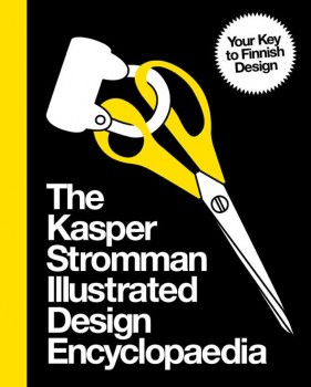 Hey, design hipsters, wherever you are – after the super-serious focus brought about by Helsinki’s year as World Design Capital 2012, here’s a way to blow off steam.
Written by the comic-strip artist, illustrator and designer Kasper Strömman (born 1974), The Kasper Stromman Illustrated Design Encyclopedia (HuudaHuuda, 2013) consists of a series of post-ironic sound-bites on Finnish material culture.
Strömman was voted Graphic Designer of 2013 in Finland by Grafia (Association of Visual Communication Designers), by a jury that considered him to be a ‘catalyst, challenger and the standup comedian of graphic design’.
His book really is encyclopaedic, with entries ranging from the usual suspects (Artek, Arabia, Iittala) through the iconoclastic (in purist design terms, anyway: Angry Birds, the heteka sofa bed, Nokia gumboots and mobile phones) and the everyday (hapankorppu crispbread, vihreä kuula sweets, the Anttila mail-order catalogue and store) to the just plain wacky (the Aqua Tube disposable toilet roll, the Konrad ReijoWaara bridge, the Superlon mattress).
There are also fun sections on how to make your own design classics – for example, a pair of original orange Fiskars scissors (just use some paint) or Harri Koskinen’s glass block lamp – and outings to less-than-fashionable destinations (in eastern Helsinki) such as the Puhos shopping centre or the Itä-Pasila housing estate.
And so on. You can get a taste of what to expect at Kasper Strömman’s design blog in English (sadly discontinued, although it remains online. He’s started a new blog, although only in Finnish, entitled Kasper Diem…).
So far, so good; we like the idea, and it’s hard to think of another source that succeeds so well in bringing together every material thing we think of as Finnish. The problem is that it’s all delivered in faintly annoying one-liners – Kalevala Koru makes ‘jewellery based on bronze age findings, usually bought for you by your parents’; the Jugend style of architecture ‘should not be confused with “Hitler Jugend”’; Lapponia, Lapland in Latin, ‘useful to know if you were planning a ski trip in the Middle Ages’ – quite funny at first, but in the end they begin to get on your nerves. It’s like a diet of street food that never quite adds up to a meal.
The book’s foreword claims it to be ‘unique in the sense that it was put together with a minimum amount of research’ – no designers’ names or information-based facts. There’s an advantage here – it means that Strömman has felt free to include, among his opinions, plenty of oral and hearsay information, essential in dealing with everyday objects and their meanings.
But it also means that, too often, the author has let himself off the hook with a gag or a quip when staying with the subject would have been really rewarding. It’s a bit too much like material culture with attention deficit disorder. (It’s also hard to see who the book is really directed at – many of the jokes are so ‘in’ that it’s only those who are already in the know who will appreciate them.)
So hey, guys (Strömman refers to himself in the plural, so we will too), how about a challenge? Why not take yourselves seriously, and write the full-out version?
Renaissance man
19 November 2012 | This 'n' that
 The graphic designer Professor Erik Bruun has been awarded the Helsinki Design Award, created to celebrate World Design Capital Helsinki 2012.
Worth 10,000 euros, this special one-off award is intended to highlight the remarkable work of Erik Bruun (born 1926). His internationally recognised life’s work – from the 1950s onwards – includes commercial posters, book and journal design, logotypes, postage stamps and bank notes, photography and nature posters. Recently his best designs of the 1950s have been experiencing a renaissance as, for example, printed material and posters.
Finnish nature, its flora and fauna, in particular endangered species, have been close to his heart, and his Saimaa ringed seal poster became the emblem of the Finnish Association for Nature Conservation.
Erik worked with us at Books from Finland as Art Editor from 1976 to 1990. He has lived for decades in an old wooden house on the UNESCO World Heritage Site islands of Suomenlinna (Sveaborg) in Helsinki harbour, and his observations of his winged friends, various sea birds, were often the subject of discussion over Books from Finland layouts.
The logo he created for Books in 1978, a quill with an eagle’s eye, featured on the covers of almost 50 issues of the journal; the illustration here, with the text Images from Finland, is from a catalogue introducing graphics and poems from a portfolio published by Eurographica in 1978.
Our editorial process went digital in the early 1990s – but Erik still works with his quills and pens, not with computers.
Congratulations!
Egg in a Cage?
17 August 2012 | This 'n' that
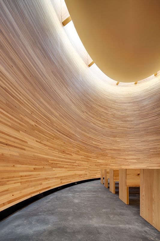
Noises off: the Chapel of Silence. Photo: Mika Huisman/Decopic
A windowless wooden construction with a timber interior sits on a busy route between the bus and railway stations in the middle of Helsinki. The egg-shaped Chapel of Silence contains simple wooden benches, offering a moment of peace and quiet for anyone passing by.
Almost 12 metres high, 270 square metres in overall footprint, it is a sacral space, with a small cross and an altar at the back, but it is not intended for liturgical purposes – however, social services are available for private conversation during opening hours.
Helsinki is this year’s World Design Capital – together with the neighbouring cities of Espoo, Vantaa, and Kauniainen, and Lahti, a hundred kilometres to the north. Every second year the International Council of Societies of Industrial Design recognises one global city `for its accomplishments in utilizing design as a tool to improve social, cultural, and economic life’. More…
Katja Hagelstam & Piëtke Visser: 20+12 design stories from Helsinki
4 April 2012 | Mini reviews, Reviews
 20+12 design stories from Helsinki
Helsinki: WSOY, 2011. 191 p., ill.
ISBN 978-951-0-38120-5
€35, hardback
In Finnish:
20+12 muotoilutarinaa Helsingistä
ISBN 978-951-0-38136-6
In celebration of Helsinki’s status as World Design Capital 2012 comes this volume of vignettes of the city’s designers. Twenty Helsinki designers and artists – from textile designers and animators to illustrators and industrial designers – are interviewed by Eva Lamppu about their work and the inspiration they find in their city. The result, handsomely illustrated with atmospheric photographs by Katja Hagelstam, is a fascinating composite portrait, a colourful patchwork of creative lives lived out against the compact and interconnected fabric of this small northerly capital, which – not unexpectedly – is revealed as both sympathetic and conducive to good design. The book is rounded off by suggestions from 12 people active in creative fields on the city’s future. A fascinating and heartwarming study.
Beautiful books
9 March 2012 | In the news
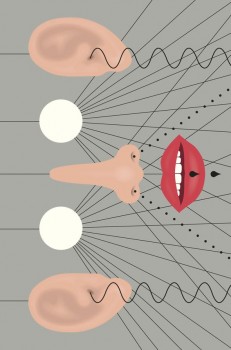
Design: Markus Pyörälä. The cover of Runojä (‘Poemms’) by Harry Salmenniemi
The Finnish Book Art Committee chooses the most beautiful books of the year from various categories of publications, and awards the prize of the Most Beautiful Book of the Year.
Graphic design, typography, cover and binding are all taken into consideration. Honorary diplomas are awarded to the designers, publishers, printers and other production units of the prize-winning books.
The Finnish Fair Foundation makes an annual grant to the Finnish Book Art Committee, which works in cooperation with the National Library of Finland. Representatives from various fields participate in the work of the juries. The prizes has been awarded since 1947.
This year the Most Beautiful Book of the Year was a collection of poetry by Harry Salmenniemi, Runojä (Runoja, ‘Poems’, deliberately misspelt in the title – ‘Poemms’?). The graphic designer is Markus Pyörälä, the publisher, Otava.
The jury commented: ‘Just as in the poetry itself, all the senses are engaged on the cover. The typography, so instrumental to prose poetry, provides structure and surprises…. All traditional beauty is there too: the tender touch of the paper, the snappy binding and the skillfully chosen fonts. Gold on the cover, overall, platinum.’
Life is
16 February 2012 | Letter from the Editors
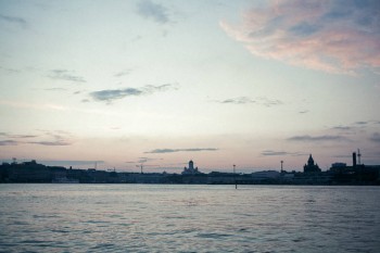
Helsinki silhouette. Photo: Valtteri Hirvonen, Eriksson&Company / World Design Capital Helsinki, 2011
Where is Books from Finland located?
In the old days, the answer was simple, although not unambiguous. Books came from its office in central Helsinki; it was written in various locations in Finland and abroad, and translated mainly in England and the United States; and it was published in the small town of Vammala, about 200 kilometres north of Helsinki.
It spread, in multiple paper copies, to readers throughout the world, to find its place on desks, on bedside tables, in briefcases and handbags, propping up table-legs or holding doors open – in London, England, Connecticut, New England, with a few in Paris, France, and Paris, Texas, maybe. More…
Helsinki: World Design Capital 2012
13 January 2012 | This 'n' that
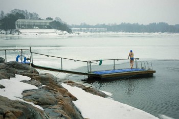
Swimming in the rain: winter joys of Helsinki. Photograph: Valtteri Hirvonen – Eriksson & Co.
After Turin (Italy, 2008) and Seoul (Republic of Korea, 2010), 2012 Helsinki is the third World Design Capital, selected in 2009 by the International Council of Societies of Industrial Design (ICSID).
Helsinki was considered to be a city where ‘design has for decades been a pivotal enabler to building an open city’.
The theme is ‘Open Helsinki – Embedding Design in Life‘. The idea is to improve the everyday life and environment of the citizens and the development of both public services and private enterprises.
In addition to Helsinki, the realisation of the Design Capital year will be carried out by four other cities: neighbouring Espoo, Vantaa and Kauniainen as well as Lahti (some hundred kilometres north of the capital). The Finnish government, two ministries, 21 commercial companies and some universities will co-operate in this project, which has a budget of 16 million euros (2010–2013).
The programme includes some 300 different events, half of them development projects, themed ‘The changing city’ or ‘New solutions’; the other half consists of various exhibitions and encounters for the citizens of Helsinki, tourists and design people.
The ultimate goal of this all is said to be ‘permanent change’. Whatever that really means – good luck!
However, as writer and design critic Kaj Kalin noted in a review in Helsingin Sanomat newspaper (30 December), Finland is full of well-educated designers, but lacks both investment money prepared to take risks and working industry: soon all production will have moved to cheaper countries – and nobody will be able to produce anything. New Finnish design, Kalin argues, mostly approximates merely to ‘a show parade of models and prototypes’.
Away with darkness
28 December 2011 | This 'n' that
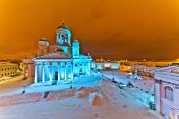
Helsinki Cathedral, lit by Martin Kuhn. Photo: Ralph Larmann
Helsinki is about to celebrate its third Season of Light. A team of designers and artists have created a series of works that will transform the urban milieu and buildings into ‘an experience for the senses and emotions’ in early January (31st December to 9 January).
For example, Helsinki Cathedral will be illuminated by light artist Mikki Kunttu, accompanied by a special sound environment. The light installation will run every day from 5 pm to 11 pm.
The German lighting designer Martin Kuhn will create an installation around Unioninkatu street, using LED technology. It will run from 6 pm to 10 pm.
Take a look at the programme – there are also photo and video samples from the previous Seasons of Light – here.
Who knows whether Helsinki will see any snow at New Year either (Christmas was black this time); nevertheless, these colours will brighten up the darkest hours in the city.
And hey, the winter solstice is already behind us, there is going to be more and more light each day!
HEL YES!
24 September 2010 | This 'n' that
Run that by me again, please?
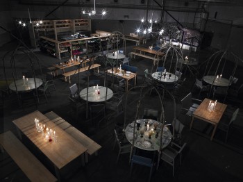
Oh: HEL is the airport abbreviation of Helsinki, and the second word completes the title given to a pop-up restaurant set up by a team of Finnish designers and chefs in London. It takes place at 1–3 Wenlock Road, London N1, between 15 September and 3 October.
HEL YES! is commissioned and produced by the Finnish Institute in London as part of its Arts & Culture Programme, in anticipation of Helsinki’s role as World Design Capital in 2012.
The restaurant offers inventive Finnish dishes, the dinner service plates are mix ‘n’ match vintage Iittala and the diners sit on Alvar Aalto and Artek’s ‘403’ chairs painted in a new range of colours.
We hear the reservations for dinner are now been fully booked, but coffee and drinks are available in the restaurant, a former depot. See what the press said, here.

